
Who else but a quirky designer (me!) would be shopping in a home decor store and end up purchasing a new crystal bracelet in chartreuse?

Have you met chartreuse? It’s a bright, eye-catching color that is halfway between green and yellow. I tend to like obscure shades like this – they are fun and relaxed while at the same time beg me to not take life too seriously!
Chartreuse is fun, it’s stimulating, it’s refreshing… such a vibrant color that for me takes a well deserved spot as one of the hottest colors in 2013 fashion. It makes any room memorable – whether it is used as a wall color, an upholstered piece or in a more conservative way as an accessory. It will never disappoint with its air of mystery and edgy mix of vintage and modern.

The key to making chartreuse work is to use it sparingly so that it is not too overpowering. It adds energy and fresh happy appeal to any room in such a great way, but as lovely as it is, I tend to use it only as punctuation to a room to temper its boldness. Chartreuse must be paired with the right grounding colors in my rooms – and they may not be as predictable as you think. It pairs exceptionally well with navy, charcoal and teal – each providing a winning combination of colors for exceptional impact.
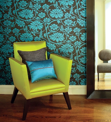
This is a perfect example of the visual impact of this color, bold in a minimal way. Don’t underestimate the virtue of going green.

If you’re not a chartreuse fan now, not to worry, I think I can win you over! There is definite character in this color and it takes courage to wear it or live in it. If you’re up for the challenge, rock it for all you’re worth!….I guarantee it will not disappoint!